Choosing colours for your colour palette is a crucial step in bringing your brand to life on your website!
It can be lengthy, overwhelming process but I can’t stress how important it is. Having a strong brand colour palette plays such an important role in your brand’s recognition. This helps consumers easily identify your product or brand and builds trust and awareness.
Having a basic understanding of colour theory can be very helpful in this process.
Each colour should play a certain role in your colour palette and should evoke certain emotions within your audience. For example, a romantic brand may choose dark reds, an energetic brand may choose oranges while calming one may choose light blues.
There is also more strategic approach when choosing the best colours for your brand when thinking of which colours would draw in your ideal client.
A general rule is to have 5 brand colours for your brand.
2 MAIN COLOURS + 2 NEUTRAL COLOURS + 1 ACCENT COLOUR
Main Colours:
Always choose one main bold colour and then a colour that compliments it. These will be your two main brand colours that will create brand recognition.
Neutral Colours:
Now you need to find a couple of neutral colours (dark and light) that compliment your main colours and help balance the colour palette. These will mostly be used for background and supporting elements (light neutral) and paragraph text (dark neutral)
Accent Colours:
The accent colour is a playful and vibrant one. It compliments the rest of the colour palette nicely and is used sparingly throughout your brand. These are used for grabbing your audience’s attention and can be used for Call To Action buttons.
However, you can also have lighter and/or darker options for each main colour. This allows you to have plenty of colours for any situation while still maintaining consistency and brand recognition. When choosing them you’ll want to document and save your colour codes, RGB code (used for digital), CMYK code (used for print).
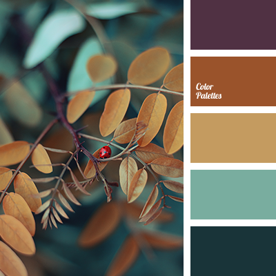
A great tool you can use for generating colour schemes is coolors.co

COLOUR PALETTES
MONOCHROMATIC: Uses variations (lightness and saturation) of a single colour. This palette can also incorporate neutral colours such as white, black, or grey.
ANALOGOUS: Uses colours that are next to each other on the colour wheel. For example, red, orange, and yellow. It’s similar to a monochromatic palette but has the opportunity to look richer. It is often most effective to select one dominant colour, a secondary colour and a third as an accent colour.
COMPLIMENTARY: Complimentary colours that are opposite to each other on the colour wheel, for example, red and green. When placed next to each other, there is an extremely strong contrasting and vibrant effect.
Triadic: A triadic colour scheme uses three colours which are evenly placed around the colour wheel. The resulting effect is a vibrant scheme, even with low saturation. It is important to properly balance the colours not to overwhelm the viewer.
Generally, a dominant colour is selected and the other two colours are used as accents.
Split-Complementary: This is a variation of the complementary colour scheme. In addition to the dominant base colour, there are two complementary adjacent colours.
This colour scheme is easier to balance than the complementary colour scheme.
Tips for picking your colour palette
If you had to describe your brand in three words what would they be?
Is your brand timeless, energetic, romantic, calming, relaxed, upbeat, playful, serious, sophisticated?
It is also important to choose colours that will remain timeless instead of colours that are currently trendy.
When you choose timeless colours, your brand will need fewer updates to stay current. This leads to stronger brand recognition.
When you choose timeless colours, your brand will need fewer updates to stay current. This leads to stronger brand recognition.
Another important thing is to pick colours that are relevant to your brand’s values, mission, and industry. Your brand colours should be a unique reflection of your business and your services.
At the end of the day, the perfect colour palette for your brand is something that you LOVE and feel connected to.